The Leys
Dowie has worked with The Leys School Cambridge since 2005, when we redesigned its brand.
Having design control over almost all materials allowed us to create and build a strong, uncompromised brand for The Leys School. Numbers grew significantly from 2006 to 2010, and the school still enjoys plentiful applications.
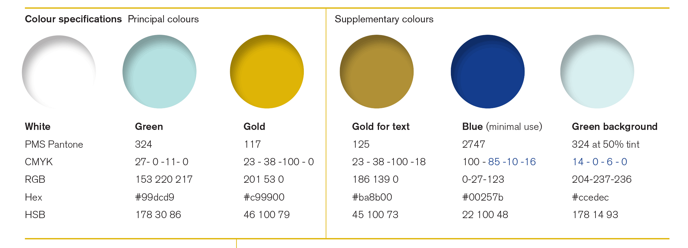
The Leys original colour scheme across all literature was dark blue and red. The school had the courage to allow us to change not only the logotype, but also to introduce a fresher colour palette and to redraw their historic crest. The result is a fresher, sharper, friendlier mood to the school materials.
The new colour palette introduced primary colours of Cambridge blue, antique gold and white, supported by a secondary colour palette for support materials. The result is a more lively and a more accessible feel in both the brand application and tone of voice.
Material produced includes
Brand creation: logo, logo type, colour palette
Redrawn crest
Prospectus box set
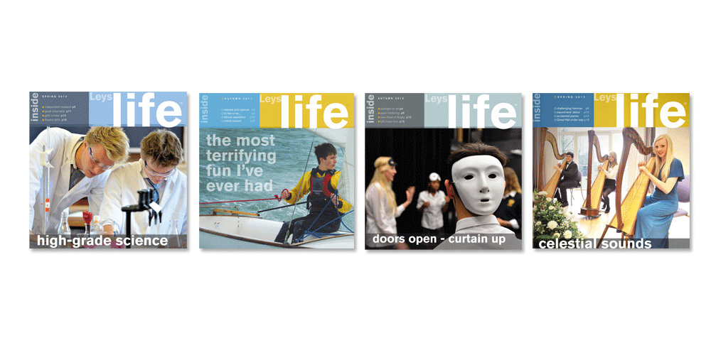
Life magazine (now on issue No.27)
Stationery design
Advertising
Website
Signage system and design
School minibuses livery
Uniforms
School calendars (x16)
Location map
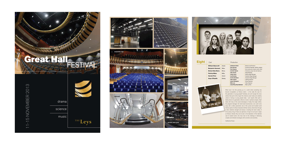
Great Hall opening brochure
Display banners
Sixth form brochures
Photography and art direction
Brand guidelines
back to our work


