Mason Campbell
Originally launched back in 2000, Mason Campbell was a management consultancy with a very different edge, and wished to appear so.
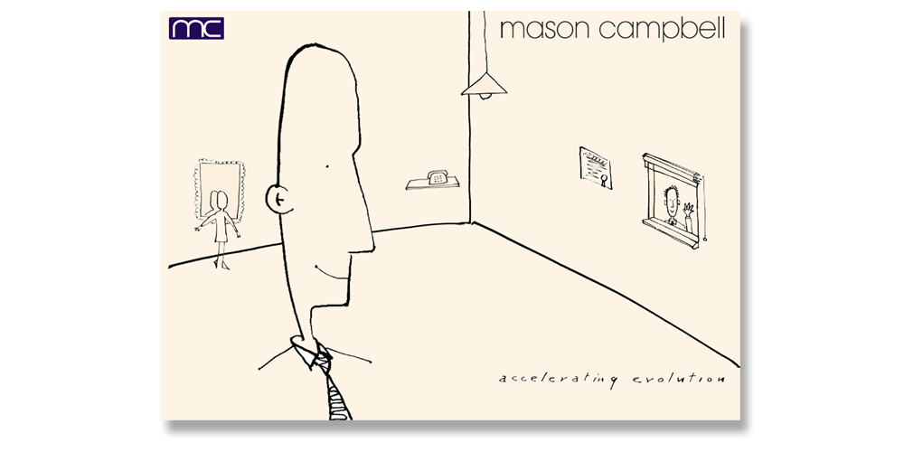
Dowie used a scratch pen illustrative style to convey the fresh and lively approach that Mason Campbell brings to clients, focusing on unpredictable but very approachable graphics to encourage curiosity. Illustrations were produced in-house by Rob Dowie.
The original home page held no text other than the logo and strapline. Each item in the image had a rollover state which showed the subject area in scratchpen lettering. The mirror was 'about us', the window was 'what others say about us', the telephone 'contact us' and the lightbulb was 'our ideas' etc. It created a lively interactive site with a contemporary edge.
Work produced:
Branding
Stationery
Illustrations
Website
Promotional leaflets
Powerpoint styling
back to our work